London 2012 Olympics
To get to the Games, go with pink
London’s hosting of the Olympic and Paralympic Games in 2012 brought phenomenal prestige, a well-touted economic boost, and some epic challenges.
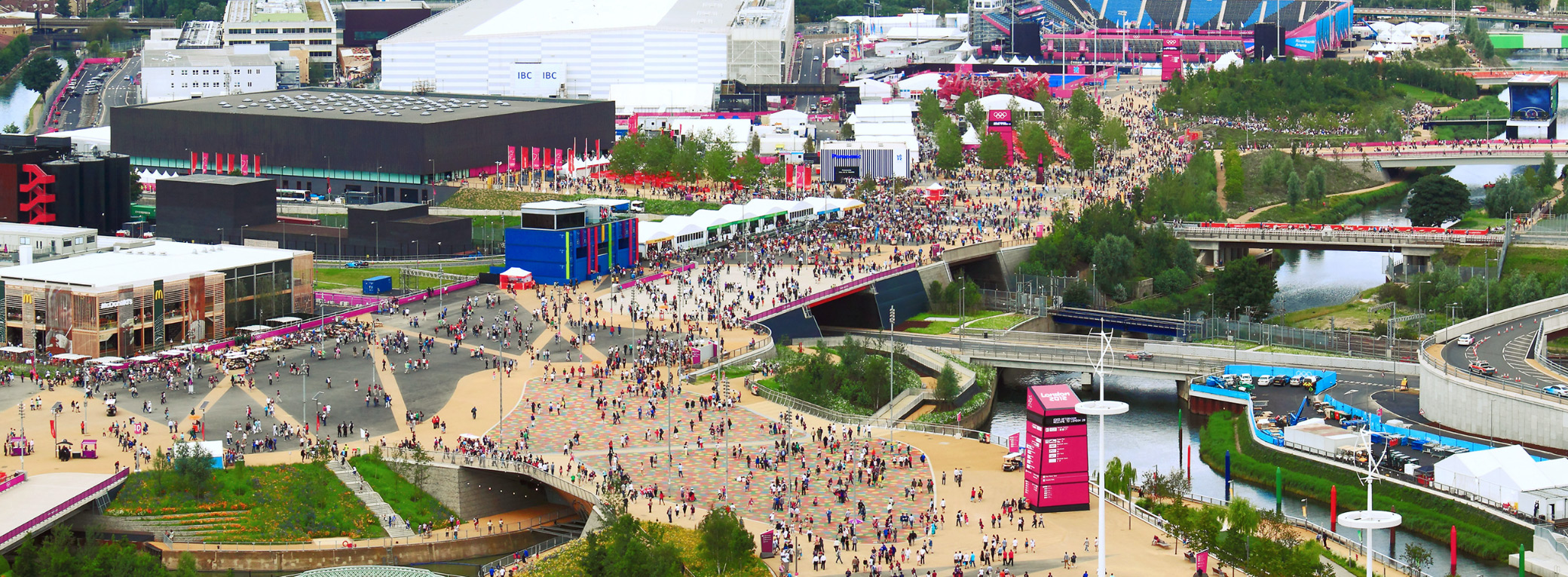
One of these: how to get 7 million spectators from home to their seats, and back, efficiently and safely? It was the largest, most complex temporary transport challenge ever faced by London and the UK. (In the event, an estimated 20 million spectator journeys were made in London alone, three million on the busiest day.)
I was brought in to join the wayfinding team at LOCOG over the span of nine months. Our unit shared a floor with a host of design teams delivering customer experience and the Look of the Games across every touchpoint that spectators, sponsors, the media, athletes and officials would come into contact with—medals, tickets, transportation, venue and street dressing, vehicles, venues, and, our responsibility; signs and navigation.


Dynamic sign shapes were drawn from the ‘energy line grid’ developed by Wolff Olins, upon which the 2012 logo had been drawn

Together with the Head of Wayfinding, I co-authored the wayfinding strategy for presentation to an audience of International Olympic Committee (IOC) executives. This sought approval for a strategy covering design principles, user needs at different points of their journeys and how the system could respond, information planning, visual identity, and product family.
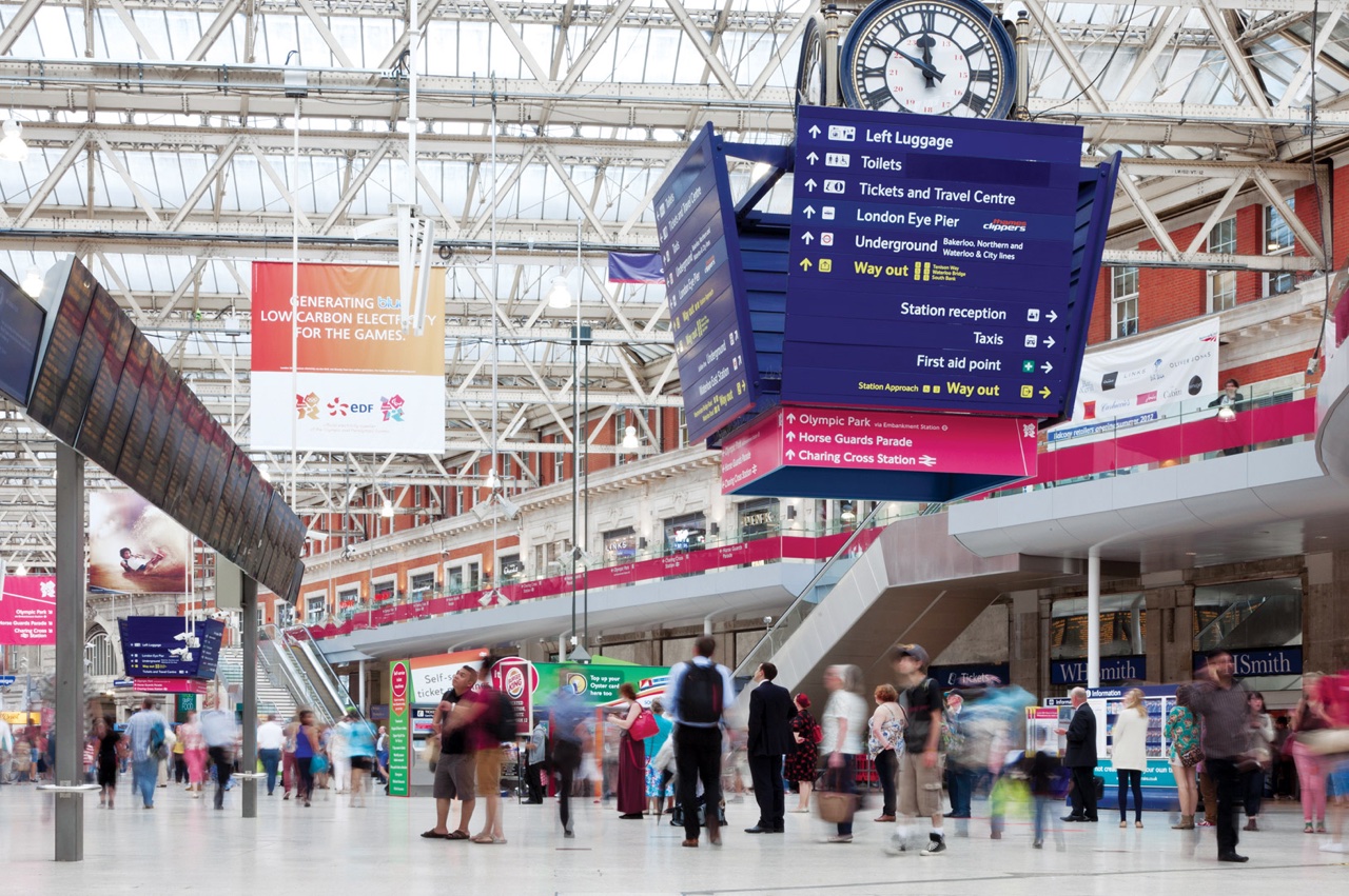
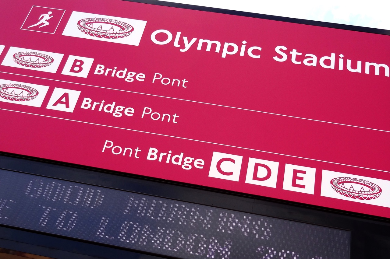
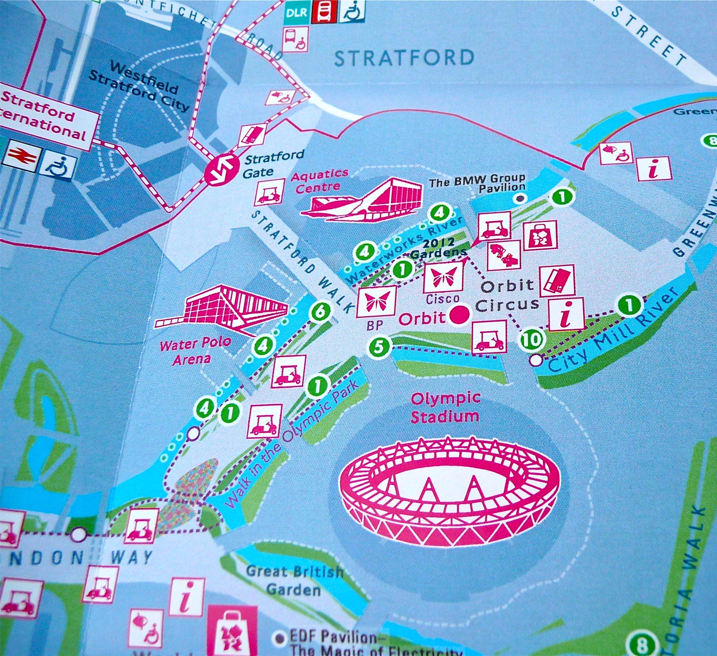
Specifically, we proposed a single color for wayfinding signs at every step of spectators’ journeys, both throughout the London and UK public transport system and for the Olympic Park and other Games venues. This ‘magenta path’ became the most characteristic feature of the strategy.

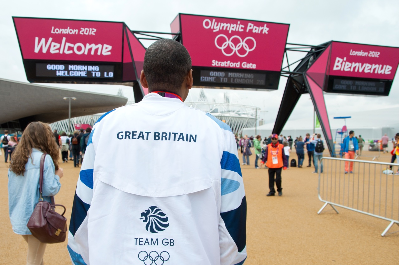
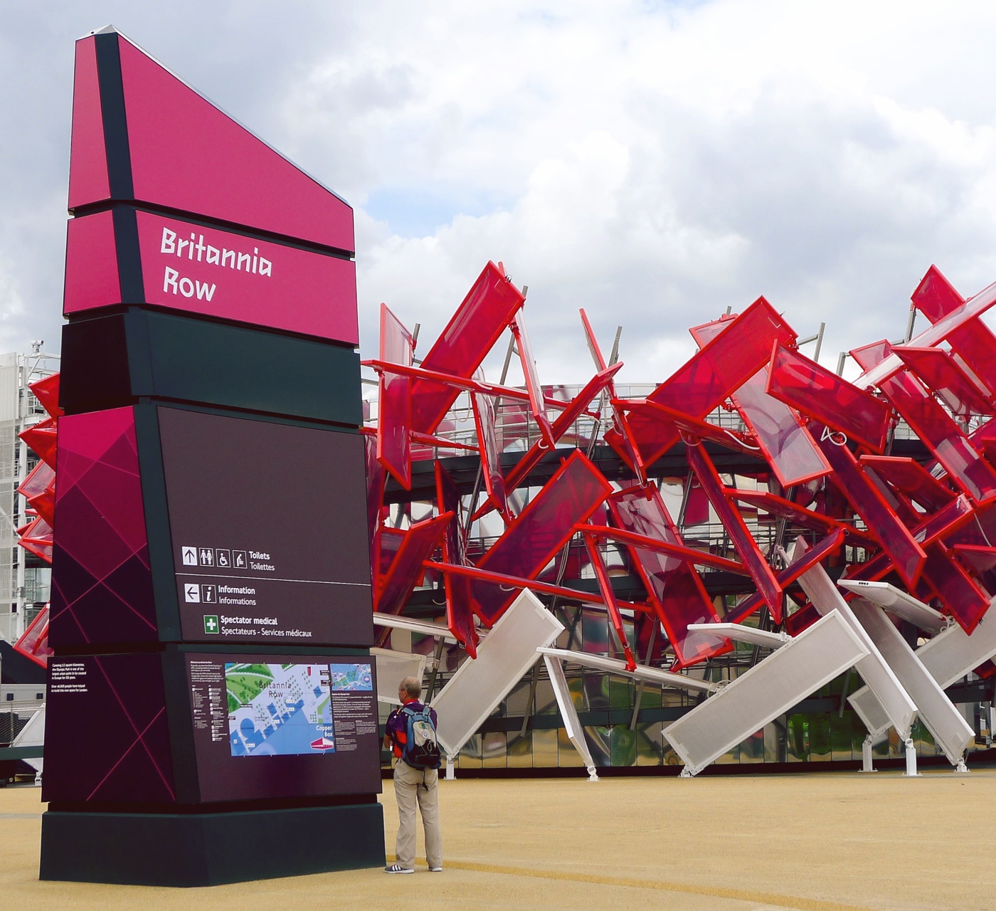
With a green light we continued to develop the major wayfinding pieces including beacons (freestanding signs), gantries (entrance gates), and maps.
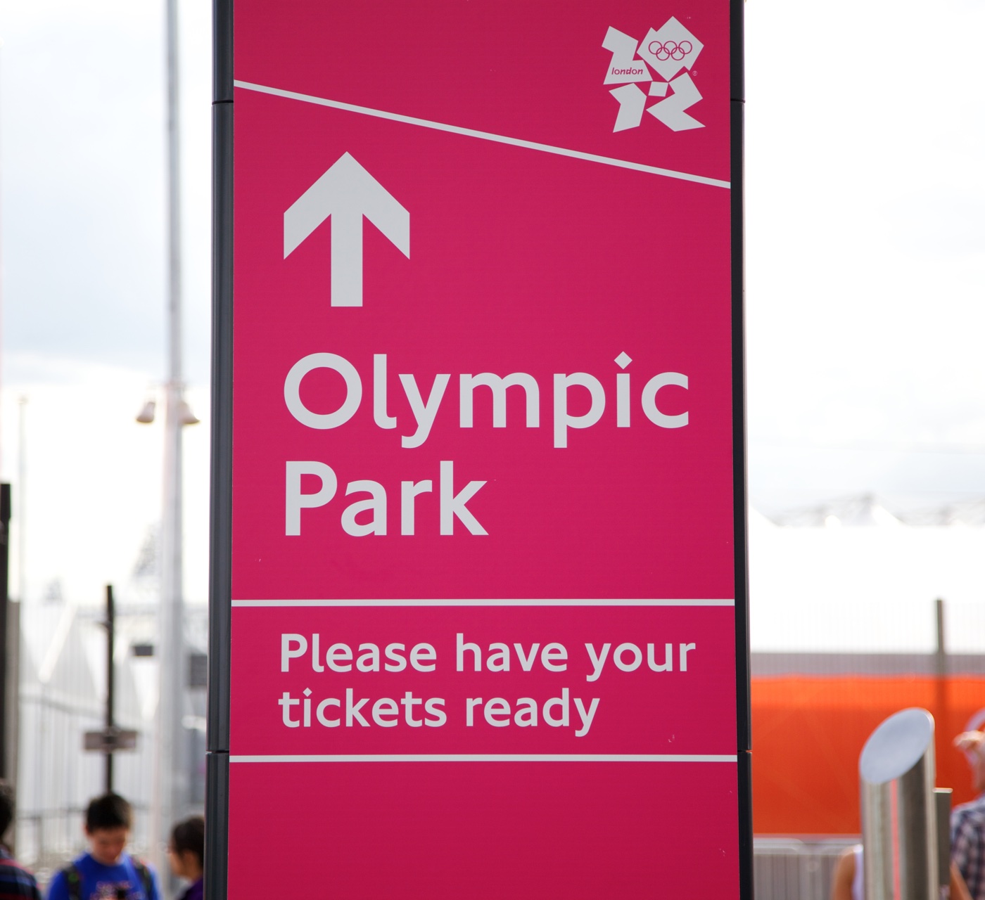
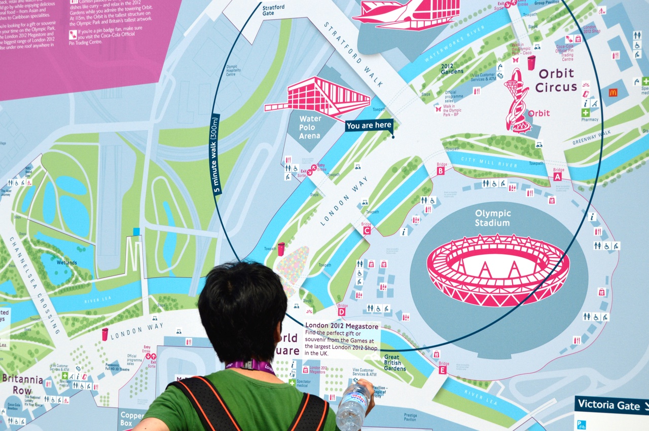
Importing inclusive design principles I had developed for Legible London, we arrived at a strategy for the largest beacons of repeating the same information twice, once at mega-graphic sizes at the top of the sign, then comparatively smaller at a height spectators could walk (or wheel) up to.
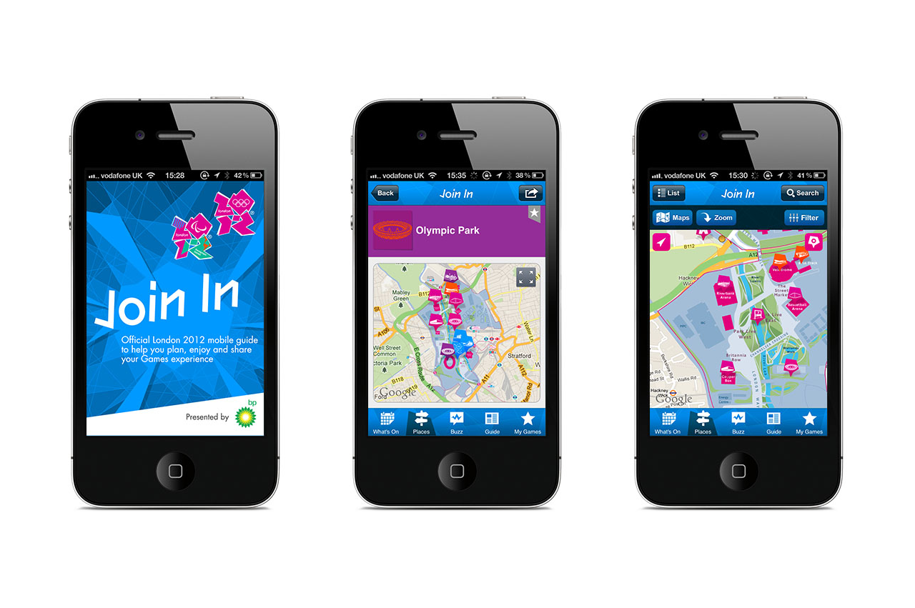
Finally I created guidelines for sign design and production across all competition venues. For maps specifically, I adapted the Legible London standard to work for the Games, demonstrated this in the design for ‘mega map’ signs to be installed in the Olympic Park, and consulted on its use in digital apps.
Featured in international design portals and publications designboom, Creative Review and more. Grand Prix winner at the Sign Design Awards 2013. Nominated for ‘Design of the Year 2013’ by the Design Museum, within the category of Transport design.
.

